🤬 Crappy confirmation messages

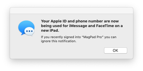
This morning I woke to all of my Apple devices displaying this horrible, confusing message. The message is unexpected because I A) haven’t touched my iPad in over a day and B) haven’t touched the Apple ID or iCloud settings in many weeks. But what is even more glaring than the unexpectedness of this message is the fact that it is wildly unhelpful.
Read the subtext of this message:
“If you recently signed into “MagPad Pro” you can ignore this notification.”
Well, Apple. No, I did not recently sign into “MagPad Pro”. I haven’t touched those settings in weeks. What am I supposed do now???
Do I call Apple support? Do I take my iPad down to the local Apple Store for help? Do I need to change the password on my Apple ID account? What is the next step for someone who did not recently log into the device you claim they did???
It frustrates me to no end when companies blindly ship code that includes horrible error or confirmation messages such as this one. No one at Apple read the text of this confirmation message while considering when the message would be displayed to users. Instead, they created a situation where a large group of users are left in a pool of confusion with no hint about how or where to take the next steps to secure their account.
This situation could be excused if the message related to something insignificant such as your printer’s settings or the default download location for files from the web, but in this case we’re talking about the security of your Apple ID, the backbone of all the services Apple provides. The vulnerability of a person’s Apple ID is anything but insignificant.
To summarize, here’s my message for product designers and engineers: Never, ever design an error or confirmation message without including a link to further help documentation. Including the relevant link to documentation will help you notice lacking pieces of information that should be included in the message. Even if you happen to produce an unhelpful message such as the one pictured above, the link to help documentation at the very least points the user in a direction towards getting help. If you instead design a message like Apple has, you leave users hanging and feeling helpless, which is a great way to make people hate your product.
🤬 Crappy confirmation messages Read More »
